CSS
CSS has existed for a long time but only become common in the last year or two. The best feature of CSS is that it allows for formatting and layout to be defined in an external file and applied to many pages.
CSS: Placing text over an inline image
CSS is a very powerful tool that works best when kept as simple as possible. Unfortunately there are a lot of applications and other HTML editors that produce CSS that is anything but simple.
A common request is to be able to display HTML text over an image that's already embedded on the page. There are a number of valid solutions using either tables or CSS.
1. Using a TABLE to overlay text on an image
The HTML solution has been possible since Netscape 3 and is fairly simple to implement, but not so flexible as more recent options.
<table width="(width)" height="(height)" background="(path to image)" cellpadding="5" cellspacing="0">
<tr>
<td valign="bottom">
<p><b><font color="#ffffff">
(text to appear over the image goes here)
</font></b></p>
</td>
</tr>
</table>| The HTML approach is to set up a TABLE with a background image. Then a single TD is used to display the text. The width and height of the TABLE are set to match that of the background image. This is a valid approach according to HTML standards, but not so good if you look at the resulting code. Why should you have to use a TABLE to handle this kind of layout? Perhaps CSS has a cleaner solution... |
2. Using CSS to overlay text on an image
Indeed there is a simpler, more flexible solution. Instead of a TABLE we use a DIV and CSS positional attributes to place futher text and images with relation to that DIV.
<div style="position: relative; background: url(path to image); width: (width)px; height: (height)px;">

<div style="position: absolute; bottom: 0; left: 0.5em; width: 400px; font-weight: bold; color: #fff;">
<p>(text to appear at the bottom left of the image)</p>
</div>

<p style="position: absolute; top: 1em; right: 2em; width: 120px; padding: 4px; background-color: #fff; font-weight: bold; font-size: 11px;">
(text to appear at the top right of the image)
</p>

</div>
As you can see, we are able to place any number of sub-elements within the surrounding div. In this case a div containing paragraphs with text (bottom left), and a paragraph by itself (top right).
The CSS approach is to use one DIV to define the area where the background image appears. This DIV has it's position attribute set to relative in order that the items it contains can be properly placed.
This is done by setting the position attribute of contained items to absolute and placing them by setting one or more of the positional attributes:top, right, bottom and left.
This is done by setting the position attribute of contained items to absolute and placing them by setting one or more of the positional attributes:top, right, bottom and left.
This block has been positioned at the top, right
The position attribute may seem complicated at first, but it's the key to implementing complicated layouts without excessive amounts of code. Remember that you need to have a container element with it's position attribute set to relative in order to layout subsequent content using absolute positioning.
Without a container element all positioning will be in relation to the viewport (the bottom of the screen). This in combination with position: fixed can create elements that stay in one corner of the screen and don't move when the page scrolls, but only in browsers other than Explorer. On this site you might see a [top] link doing just that if you're using a compatible browser.
3. References
CSS: Using floats to layout content
With people feeling they need to move away from 'old' practices such as using TABLEs for layout, and towards more 'semantic' markup, the use of CSS properties such as float and clear is increasing. But it's clear that many webmasters have little or no idea on how they actually work or the variety of ways in which they can be used.
This article focuses on the layout of content within a page, but the same rules can be applied for layout of the website itself. We start with the simplest case and work towards the more complicated.
1. Wrapping text around floated content

This image and text are contained in a DIV that has been floated to the left and assigned a width of 200 pixels. You must assign a width to floated content.
This text is in a normal paragraph following the floated DIV. The border of the paragraph can be seen as a light blue box. Note that this outline extends behind the green box of the floated DIV. This is important as it means that the left hand side of the paragraph is actually at the left hand side of the page. Just the content of the paragraph has been shifted to the right in order to 'get around' the floated DIV. This has implications if you're trying to manipulate themargin or padding on the side of the paragraph adjacent to the float.
This image and text are contained in a DIV that has been floated to the right.
Now we add a second paragraph and flesh it out with content. You should see that, once the height of the DIV has been covered, this paragraph text will wrap around it so that the text is no longer indented. A similar effect can be achieved in HTML by setting thealign attribute of an IMG or TABLE element to left.
One complication of floats is that Internet Explorer will add a a few pixels of padding between the floated DIV and the text that follows. This has no place in the standards and is simply their way of 'dumbing down' CSS and HTML. In other browsers the paragraph text will butt up against the floated DIV. If you want padding in all browsers you need to assign a margin to the floated element.
2. Using 'clear' to force content past a float
A common mistake when using float to layout content is to forget to add a clear. This is an instruction to an element following floated content that it should move down far enough that it's not going to be affected by preceding floated content.
This problem occurs when the 'normal' content following a float is not long enough to clear it. In that case you might the heading of a subsequent section being effected, or even content overflowing the 'content' section of your page. This is because floated content is 'taken out of the document flow' so won't force any containing boxes to expand down the page.
This form lets you modify the clear style for each of the three paragraphs in the preceding section so you can see the effect it has on layout.
When there are no other elements present the best way to force a container to expand around floated content is to insert an empty div with clear set to 'both' as shown here:
<div style="clear: both;"><-- --></div>
For more details on floating content and clearing floated content see the link to the W3C visual formatting model under References below.
3. Using floats to break content into columns
This is the first column
A slightly less common, but very powerful use for floats is to group content into columns. This can be done by floating a DIV to the left to form the left hand side column, then adding a second DIV, alse floated to the left to sit beside it. Each DIV must have a width and you can add a right-margin to the first DIV to separate the columns.In many cases this makes the use of TABLE elements unnecessary.
This is the second column
You can see that the content in this box sits adjacent to the first paragraph and, unlike our first example, doesn't wrap around once the height of the first float has been cleared.
With this kind of layout youmustremember to add a clear after the last DIV, otherwise subsequent content can appear in and around the two columns.
You're also not limited to just two columns and can quite easily have three or four across the page. There are also other options. For a three-column layout you could float DIVs to the left and right and have 'normal' content appearing in between - like the section in our first example where text appears between the two green boxes.
Note: for anyone looking at the code behind this form, be aware that the standard 'scriptable' property for setting the float direction is cssFloat instead of float which has other uses in JavaScript and is a reserved word. Internet Explorer instead uses styleFloat.
4. Using floats to 'tile' images and text
Now we come to something that should be simple but in fact is very complicated. If you have a lot of small DIV's - photos in a photo gallery for example - you can create a simple page by simply floating them all to one side.
This works perfectly when the items to be floated all have the same height:
but fails miserably when the height varies as 'taller' items prevent those that follow from floating all the way to the left hand side:
Note: reload this page to see a different configuration.
If this is the case then the safest option is to refert to using a TABLE for layout. In some cases you could avoid that by inserting a clear="left" to every nth element, but that can become difficult to maintain when items are added or removed.
5. References
The CSS2 border-collapse property allows you to quickly create formatted tables using plain HTML markup.
1. Collapsing borders
Here is a sample CSS snippet that contains all you need to format tables with any range of colours, borders and other effects:
<style type="text/css">

  table.t1 {
    margin: 1em 0;
    border-collapse: collapse;
  }
  .t1 tr {
    border: 1px solid #666;
  }
  .t1 th {
    padding: 2px 4px;
    background: #ccf;
    border: 1px dotted;
    white-space: nowrap;
    text-align: left;
  }
  .t1 td {
    padding: 2px 4px;
    border: 1px dotted;
    background: #ffc;
  }

</style>
Essentially, setting the border-collapse property to collapse allows borders to be applied to TR's and TD's in ways that aren't possible using CSS1.
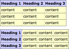
The styles above have been applied to two tables below. The tables are marked up using nothing fancier than TH for headings and TD for content:
| Heading 1 | Heading 2 | Heading 3 |
|---|---|---|
| content | content | content |
| content | content | content |
| content | content | content |
| Heading 1 | content | content | content |
|---|---|---|---|
| Heading 2 | content | content | content |
| Heading 3 | content | content | content |
This is how it should look:
Using the standard TABLE model would require twice as much code, as you'd have to set the background colours, borders and text alignment for each row or cell.
You might want to pay special attention to the section on Border conflict resolution in the W3C specifications. It explains how precedence is determined when borders belonging to different elements overlap.
To summarise, a border that appears 'more solid' will override one that is 'less solid' with the exception of those that are 'hidden'. That explains why, in our example, the solid borders around the rows over-ride the dotted borders around cells.
If your browser renders the above tables differently than the sample provided, it probably isn't following these rules.
Once you've set the border-collapse property of a table to collapse, you can add individual borders to any rows or cells in that table. Here's another demonstration:
| 1 | 2 | 3 |
| 4 | 5 | 6 |
| 7 | 8 | 9 |
You should be seeing a red square inside a yellow one. There will also be a partial green box around the '9', but as it's a 2px border, it is overruled by the other, 3px, borders (see 'border conflict resolution' above).
2. References
CSS: Tables: border-collapse: separate
The CSS2 border-collapse property allows you to quickly create formatted tables using plain HTML markup.
Here is a sample CSS snippet that contains all you need to format tables with any range of colours, borders and other effects:
table {
  border-collapse: separate;
  border: 1px solid #666;
  background-color: #ccf;
}
th {
  text-align: left;
}
td {
  border: 1px solid #666;
  background-color: #ffc;
}
Essentially, setting the border-collapse property to separate allows borders to be applied to table cells in ways that aren't possible using CSS1.
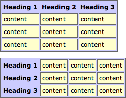
The styles above are applied to two tables below that are marked up using nothing fancier than TH (for headings) and TD (for content). The cellpadding and cellspacing values are defined in the HTML, but could also be set using CSS.
| Heading 1 | Heading 2 | Heading 3 |
|---|---|---|
| content | content | content |
| content | content | content |
| content | content | content |
| Heading 1 | content | content | content |
|---|---|---|---|
| Heading 2 | content | content | content |
| Heading 3 | content | content | content |
this is how it should appear:
This kind of layout is not possible using the standard TABLE model.
1. Combining border-collapse with other properties
This last example combines the 'separated' table model with the experimental border-radiusproperty:
| Heading 1 | Heading 2 | Heading 3 |
|---|---|---|
| content | content | content |
| content | content | content |
| content | content | content |
this is how it should appear:
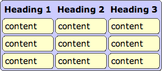
Note: As explained on the border-radius page this will work in the Mozilla browsers (Firefox, Netscape et al) and not in Internet Explorer.
2. References
CSS: The nth-child Pseudo-Class
The nth-child pseudo class in CSS3 is very useful for creating formatted Excel-style tables in HTML. Also for generating grid layouts without having to resort to a table.
1. nth-child Basic Rules
The syntax we are working with is :nth-child(an+b) where a is the frequency and b is the initial offset. This generated an infinite series starting with n=0, but containing only positive values.
Some examples might make this clearer:
- 2n, 2n+0 or even
- 2, 4, 6, 8, 10, 12,...
- 2n+1 or odd
- 1, 3, 5, 7, 9, 11, ...
- 2n+2
- 2, 4, 6, 8, 10, 12, ...
- 2n+3
- 3, 5, 7, 9, 11, 12, ...
- 2n+4
- 4, 6, 8, 10, 12, 14, ...
- 3n, 3n+0 or 3n+3
- 3, 6, 9, 12, 15, 18, ...
- 3n+1
- 1, 4, 7, 10, 13, 16, ...
So you can see that the series starts from b and then increments by a for each value. Any results that would be zero or negative are skipped meaning that we can't look backwards in the DOM tree.
2. Example using hover effects
This example makes use of the nth-child pseudo-class in combination with the ~ general sibling selector.
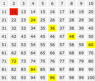
Firstly we create the grid by simply floating a number of DIVs to the left and using nth-child to start a new row after every ten boxes:
<style type="text/css">

  #stage div {
    float: left;
    margin: 5px;
    width: 60px;
    height: 50px;
    background: #efefef;
  }
  #stage div:hover { background: red; }
  #stage div:nth-child(10n+1) { clear: left; }

</style>
In the HTML we've added an id to each of the DIVs (#div1, #div2, ..., #div100) and then assigned a hover event as follows:
<style type="text/css">

  #div1:hover ~ div:nth-child(1n) { background: yellow; }
  #div2:hover ~ div:nth-child(2n) { background: yellow; }
  #div3:hover ~ div:nth-child(3n) { background: yellow; }
  #div4:hover ~ div:nth-child(4n) { background: yellow; }
  ...

</style>
This means that every nth sibling of DIV n will turn yellow when the cursor is over DIV n. So when you mouseover the number 3 (#div3) it turns red while every DIV that is a multiple of 3 turns yellow. Try it and see:
1n
2n
3n
4
5
6
7
8
9
10
11
12
13
14
15
16
17
18
19
20
21
22
23
24
25
26
27
28
29
30
31
32
33
34
35
36
37
38
39
40
41
42
43
44
45
46
47
48
49
50
51
52
53
54
55
56
57
58
59
60
61
62
63
64
65
66
67
68
69
70
71
72
73
74
75
76
77
78
79
80
81
82
83
84
85
86
87
88
89
90
91
92
93
94
95
96
97
98
99
100
This will work in every browser that supports both nth-child and the ~ selector. Here you can see screenshots for a couple of different cases:
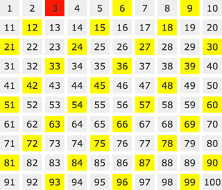
3. Formatting a TABLE using nth-child
A more typical CSS example is how to format an HTML table to make it look more professional - with alternating column or row colours for example:
| 1 | 2 | 3 | 4 | 5 | 6 | 7 | 8 | 9 | 10 |
| 11 | 12 | 13 | 14 | 15 | 16 | 17 | 18 | 19 | 20 |
| 21 | 22 | 23 | 24 | 25 | 26 | 27 | 28 | 29 | 30 |
| 31 | 32 | 33 | 34 | 35 | 36 | 37 | 38 | 39 | 40 |
| 41 | 42 | 43 | 44 | 45 | 46 | 47 | 48 | 49 | 50 |
| 51 | 52 | 53 | 54 | 55 | 56 | 57 | 58 | 59 | 60 |
While not terribly pretty, the markup is very simple and you can easily change the colours. For the 'tartan' effect we've used background colours with some alpha-transparency, so where the column (red) and row (blue) colours meet it creates a third (purple) colour.
The TABLE has a class value of "tartan" for this example:
<style type="text/css">

  .tartan tr:nth-child(odd) {
    background: rgba(0,0,255,0.5);
  }
  .tartan td:nth-child(even) {
    background: rgba(255,0,0,0.5);
  }

</style>
To target the intersecting cells directly, so as not to require transparent backgrounds and to be able to specify another colour, we could also use:
<style type="text/css">

  .tartan tr:nth-child(odd) td:nth-child(even) {
    background: #fff;
  }

</style>
This targets all table cells that are even children of odd rows. And here is the result:
| 1 | 2 | 3 | 4 | 5 | 6 | 7 | 8 |
| 9 | 10 | 11 | 12 | 13 | 14 | 15 | 16 |
| 17 | 18 | 19 | 20 | 21 | 22 | 23 | 24 |
| 25 | 26 | 27 | 28 | 29 | 30 | 31 | 32 |
| 33 | 34 | 35 | 36 | 37 | 38 | 39 | 40 |
| 41 | 42 | 43 | 44 | 45 | 46 | 47 | 48 |
| 49 | 50 | 51 | 52 | 53 | 54 | 55 | 56 |
| 57 | 58 | 59 | 60 | 61 | 62 | 63 | 64 |
You'll notice in the above styles that we've used the odd and even shorthand - which is probably all you will need for a simple application - and much easier to remember. See under Related Articles for more examples of styled TABLEs.
5. References
CSS: border-radius and -moz-border-radius
One of the most keenly-anticipated CSS3 properties isborder-radius. Web designers will no longer have to resort to complex table structures using custom-made corner graphics or including arcane JavaScript files in order to produce designs with rounded corners.
While Internet Explorer before IE9 doesn't support many (or any) advanced CSS properties, the Mozilla (Firefox and related browsers) and WebKit (Apple's web browser engine used in Safari andChrome) and Opera have supported them for many years.
The vendor prefixes (-moz, -webkit) are now no longer necessary for the latest browser releases as they have all adopted the official CSS3 syntax.
1. Definition and syntax for border-radius
As with many CSS properties relating to margins, padding and borders, there are four individual properties - one for each corner of a box element - and one shorthand property. Each of the corner attributes will accept either one or two values. The border-radius property will accept up to two values in WebKit browsers and up to eight now in Firefox 3.5.
Here are the CSS and browser-specific attributes in question:
| CSS3 | Mozilla equivalent | WebKit equivalent |
|---|---|---|
| border-top-right-radius | -moz-border-radius-topright | -webkit-border-top-right-radius |
| border-bottom-right-radius | -moz-border-radius-bottomright | -webkit-border-bottom-right-radius |
| border-bottom-left-radius | -moz-border-radius-bottomleft | -webkit-border-bottom-left-radius |
| border-top-left-radius | -moz-border-radius-topleft | -webkit-border-top-left-radius |
| border-radius | -moz-border-radius | -webkit-border-radius |
Prior to IE9 these CSS3 properties do not work in Internet Explorer. The 'Mozilla' versions however work perfectly well in Firefox and other Mozilla-based browsers and the 'WebKit' ones in Safari and Chrome as well as the iPhone/iPad.
Each of the individual corner CSS3 properties take either one or two length values (generally 'px' or 'em' values). If a single value is supplied then that becomes the radius of a rounded corner. If two values are supplied then they become the horizontal and vertical radii for an elliptical corner.
The Mozilla syntax before Firefox 3.5 only supported round (as opposed to elliptical) corners and adding a second value would result in a standard square corner.
The border-radius property in WebKit accepts one or two values and uses them to style all four corners making a nice symmetric shape. The new Firefox syntax allows you to define four different round or elliptical corners. A slash has been introduced to separate the horizontal and verticallength settings.
There is no pure-CSS solution for rounded corners in IE8 or other primitive browsers. Only a range of JavaScript patches which can be found by searching online.
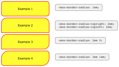
2. Using -moz-border-radius in Mozilla (Firefox)
The following examples will only work if you're using Firefox or another Mozilla browser that supports -moz-border-radius properties.
Example 1
-moz-border-radius: 1em;
Example 2
-moz-border-radius-topright: 2em;
-moz-border-radius-topleft: 2em;
Example 3
-moz-border-radius: 2em 0;
Example 4
-moz-border-radius: 3em 1em;
The Mozilla properties used here do not conform to the standard (hence the -moz- prefix) and until Firefox 3.5 only supported round corners. In newer versions of Firefox elliptical corners are also possible.
As some people have pointed out these properties can be used not just for 'boxes' but for many other HTML objects including form elements.
For those of you still seeing square corners, here's a snapshot from Firefox showing the rounded corners effect:
There are a number of tricky JavaScript solutions that allow border-radius and other CSS3 properties to be seen in Internet Explorer and other browsers - but the overheads don't really justify the results.
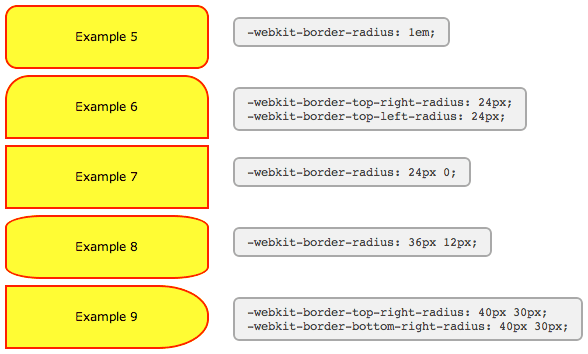
3. Using -webkit-border-radius in Safari (Webkit)
The latest versions of Safari now support -webkit-border-radius. Previously only the 'nightly builds' contained this functionality In Opera the syntax for the corners is the same as in Safari, but the behaviour of border-radius with two values matches that of Firefox, as seen in Example #7 below:
Example 5
-webkit-border-radius: 1em;
Example 6
-webkit-border-top-right-radius: 24px;
-webkit-border-top-left-radius: 24px;
Example 7
-webkit-border-radius: 24px 0;
Example 8
-webkit-border-radius: 36px 12px;
Example 9
-webkit-border-top-right-radius: 50px 30px;
-webkit-border-bottom-right-radius: 50px 30px;
For those of you still seeing square corners, below you can find asnapshot from WebKit showing the rounded corners effect. Note particularly the change in syntax and the effect of passing two values to -webkit-border-radius as compared to the -moz-border-radius example above.
WebKit also has limited support for other CSS3 border properties such as: multiple backgrounds; border background images; and various advanced selectors (::select for example) making it a great test platform for forward-looking developers. Stay tuned to the Surfin' Safari blog linked below for the latest exciting developments.
4. Other special effects
WebKit, Firefox and Opera now support a number of other CSS3 features, including the following simple effects and transforms. Thankfully, unlike rounded corners, for the shadows and transforms there does seem to be agreement on a common syntax.
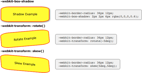
-webkit-box-shadow
Shadow Example
-webkit-border-radius: 36px 12px;
-moz-border-radius: 36px / 12px;
border-radius: 36px / 12px;
box-shadow: 2px 2px 6px rgba(0,0,0,0.6);
Clearly there are still some anti-aliasing problems, but for corners and gentle curves it can look pretty cool.
Then there are various -webkit-transform option that can be used to create all kinds of wierd and wonderful shapes:
-webkit-transform: rotate()
Rotate Example
-webkit-border-radius: 36px 12px;
-moz-border-radius: 36px / 12px;
border-radius: 36px / 12px;
-webkit-transform: rotate(-5deg);
-webkit-transform: skew()
Skew Example
-webkit-border-radius: 36px 12px;
-moz-border-radius: 36px / 12px;
border-radius: 36px / 12px;
-webkit-transform: skew(5deg,5deg);
For the browser-impaired here is a screenshot from Safari showing the effect of these CSS rules. The same effects are now possible in Firefox, Opera and related browsers. Just replace -webkitwith -moz or -o, except for border-radius and box-shadow where Opera uses no prefix.
Also in Safari these and other transformations can be implemented as animations using just CSS effects triggered by hovering over an element - no JavaScript required.
5. New short-hand properties
The following syntax is now working in Firefox and Opera allowing you to specify not only matching elliptical corners, but also different elliptical corners in one shorthand property.
Here we've recreated two of the WebKit examples above using the new syntax. You can see that the individual corner settings work exactly the same now in Firefox as in WebKit, but for the short-hand property you need to include a slash:
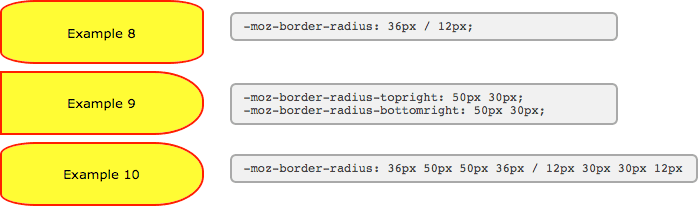
Example 8
-moz-border-radius: 36px / 12px;
border-radius: 36px / 12px;
Example 9
-moz-border-radius-topright: 50px 30px;
-moz-border-radius-bottomright: 50px 30px;
And now to the scary part. Using the short-hand property, all valued before the slash apply to the horizontal radii and all values afterwards to the vertical. In this example we've created a hybrid of the previous two examples.
Example 10
-moz-border-radius: 36px 50px 50px 36px / 12px 30px 30px 12px
border-radius: 36px 50px 50px 36px / 12px 30px 30px 12px
Here you can see what these boxes look like in Firefox 3.5:
With all major browsers now using the same syntax, the vendor-prefixes have been dropped and the standard seems to be set in stone.
6. Translations
7. References
- CSS3 module: Border W3C Working Draft 7 November 2002
- CSS Backgrounds and Borders Module Level 3 W3C Working Draft 10 September 2008
- Surfin' Safari
- The CSS3 border-radius property
- Internet Explorer: border-radius demo
CSS: Formatting a Definition List
With the comeback of 'semantic markup' people are once again looking at what's the right tag to be using for different types of information. For example, unordered lists for navigation and tables only where absolutely necessary. One commonly overlooked option for markup of glossaries and definition lists is the dl attribute itself.
1. The Definition List (DL)
We know what the basic DL output looks like - not very attractive - which is why they are rarely used by webmasters. Here you can see an unformatted list with some sample content:
- first item
- definition for first item in list
- second item
- definition for second item in list
extending across more than one line - third item
- definition for third item in list
There are two options for adding some formatting. The first is to start adding HTML tags such as <b></b> for the 'data term' (dt) and maybe a smaller font size, or italics for the 'data definition' (dd). But we can do all that and more much better using CSS.
2. Example 1
Let's start with some simple CSS styles:
  dt {
    font-weight: bold;
    text-decoration: underline;
  }
  dd {
    margin: 0;
    padding: 0 0 0.5em 0;
  }
Our simple list now looks a bit different. The indenting has been removed, some vertical padding inserted, and the data terms have been bolded and underlined:
- first item
- definition for first item in list
- second item
- definition for second item in list
extending across more than one line - third item
- definition for third item in list
That's a move in the right direction, but probably still not enough to convince people of the merits of this approach. The following example should prove more persuasive.
3. Example 2
In the first example we were just tinkering at the edges of what's possible using CSS. This example uses slightly more advanced code to further enhance the appearance of the list:
  dl {
    border: 3px double #ccc;
    padding: 0.5em;
  }
  dt {
    float: left;
    clear: left;
    width: 100px;
    text-align: right;
    font-weight: bold;
    color: green;
  }
  dt:after {
    content: ":";
  }
  dd {
    margin: 0 0 0 110px;
    padding: 0 0 0.5em 0;
  }
The list now appears as if the items were placed in a table:
- first item
- definition for first item in list
- second item
- definition for second item in list
extending across more than one line - third item
- definition for third item in list
Even the most sceptical webmaster should now be starting to re-think their position.
4. Advantages of CSS formatting over HTML
So why are we doing this again? There are a number of reasons:
- separation of content from formatting
- this is the 'holy grail' for css programmers. As illustrated by sites such as css Zen Garden, separation means that the look and feel of a site can be drastically altered without changes to the underlying HTML code.
- optimised for search engine spiders
- it pays to be friendly to spiders as they're the only way to get your site to appear in search engine result pages (SERPs). The more advanced spiders are now starting to pay attention to how content is marked up and how that information can be incorporated into their search algorithms.
- saves bandwidth
- you also reduce the amount of HTML required each time a list is presented. If the CSS is sourced from an external file then it only has to download once and the browser can use a cached version for subsequent pages.
It might take some time to 'clean up' your existing HTML code and convert lists and other elements to CSS but the advantages now and ongoing make it worthwhile.
 .rocket
#outerspace
.rocket
#outerspace
CSS: Animation Using CSS Transforms
The examples on this page will work properly in Safari, Chrome and Opera. In the Firefox prior to version 4 you will see the transforms, but without any animation. Some effects may also work now in Internet Explorer 9 if you use the -ms- vendor prefix.
The implementation of animation in CSS involves setting up a transformation to take place in response to a mouseover or other event. Then, rather than applying the effect instantly, we assign a transition timing function which applies the transformation/s over a set time period.
Firefox and Opera now support these transforms with an almost identical syntax - just replace -webkit with -moz or -o in the examples below and you will see the same effects. And you can use -ms to enable the effects for IE9.
1. Introducing CSS Transformations
The effect of a CSS Transform is to modify the appearance of an element in the browser by translation, rotation or other means. When defined in a style sheet transformations are applied before the page is rendered, so you don't actually see any animations taking place. Transforms can also be applied as a mouseover or similar effect which you can see in the next section.
Apple's proposal for CSS Transformations calls for the ability to change the perspective and work in three dimensions, but that's some way away yet. Even the features demonstrated here won't appear in other browsers until they're approved by the standards body who are still quibbling over CSS3 modules.
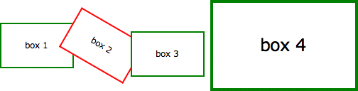
Below we've placed four identical DIV's styled as a 100 x 60 pixel box with a 2 pixel border. Subsequently, each element has been transformed in some way using the -webkit-transformproperty as follows:
| box 1 | Translated to the right: -webkit-transform: translate(3em,0); |
| box 2 | Rotated 30 degrees with the clock: -webkit-transform: rotate(30deg); |
| box 3 | Translated to the left and down: -webkit-transform: translate(-3em,1em); |
| box 4 | Scaled to twice its original size: -webkit-transform: scale(2); |
box 1
box 2
box 3
box 4
Without the translations, and the red border on the second box, you would see just four identical boxes labelled one through four. What you see in supported browsers (Safari, Chrome, Firefox, Opera), however, will be more like this:
Of note is the fact that the text is still selectable in transformed elements, even when rotated, and that scaling an element affects other properties including border widths and font sizes and not just the dimensions.
2. Animating your Transforms
While CSS Transformation in itself is a powerful tool for developers (though I shudder to think what would happen if it was more widely available), the ability to animate the same effects using-webkit-transition is far more exciting. Move your mouse over the following four boxes for a demonstration:
box 2
box 4
What you see above is the four boxes from the previous section, in their default states. When you mouseover any of the boxes, however, the CSS transformation is applied as a one second animation. When the mouse moves away the animation is reversed, taking each box back to its starting position and state. And we achieve this without using JavaScript - only HTML and CSS!
If you think that's cool, realise that CSS Animation can be applied not just to the transforms, but also to other CSS properties including: opacity, colour and a bunch of other properties.
In the next example the box on the left begins as small and green with square corners, while the one on the right is larger, with a red border and rounded corners. Hovering over either of the boxes will trigger an animation that makes box 1 take on the appearance of box 2 and vice versa.
box 1
box 2
Again, we're still only using HTML and CSS to make this happen. Without CSS Transforms the two boxes will still change their border-color, and possibly also the border-radius, but it happens immediately rather than as a one second animation.
For more advanced examples you can read our new article on using JavaScript to trigger the animation.
3. Multiple Transforms on one element
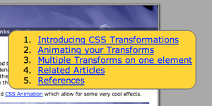
To apply more than one transformation to a single element simply list them one after another separated by spaces. The submenu for example at the top right of this page has the following styles:
<style type="text/css">

  #submenu {
    background-color: #eee;
    -webkit-transition: all 1s ease-in-out;
    -moz-transition: all 1s ease-in-out;
    -o-transition: all 1s ease-in-out;
    -ms-transition: all 1s ease-in-out;
    transition: all 1s ease-in-out;
  }
  #submenu:hover {
    background-color: #fc3;
    -webkit-transform: rotate(360deg) scale(2);
    -moz-transform: rotate(360deg) scale(2);
    -o-transform: rotate(360deg) scale(2);
    -ms-transform: rotate(360deg) scale(2);
    transform: rotate(360deg) scale(2);
  }

</style>
This means that when you hover over the submenu, it will change colour, rotate and double in size over a period of one second as shown here:
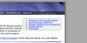 | <=> |  |
These effects are now available in the latest public release of Safari, so in principle all OSX users will be able to see these effects. Whether it's a good idea to add them to your website I'll leave up to you.
Update: Thanks to misterbisson those without WebKit can now see a screencast of the menu animation:
4. Animations in action
Now here's another example of the kind of fun we can have in combining different effects into single animation. Perhaps you can already work out what's going to happen based on the CSS?
<style type="text/css">
#outerspace {
position: relative;
height: 400px;
background: #0c0440 url(/images/outerspace.jpg);
}
div.rocket {
position: absolute;
bottom: 10px;
left: 20px;
-webkit-transition: all 3s ease-in;
-moz-transition: all 3s ease-in;
-o-transition: all 3s ease-in;
-ms-transition: all 3s ease-in;
transition: all 3s ease-in;
}
div.rocket img {
-webkit-transition: all 2s ease-in-out;
-moz-transition: all 2s ease-in-out;
-o-transition: all 2s ease-in-out;
-ms-transition: all 2s ease-in-out;
transition: all 2s ease-in-out;
}
#outerspace:hover div.rocket {
-webkit-transform: translate(540px,-200px);
-moz-transform: translate(540px,-200px);
-o-transform: translate(540px,-200px);
-ms-transform: translate(540px,-200px);
transition: all 2s ease-in-out;
}
#outerspace:hover div.rocket img {
-webkit-transform: rotate(70deg);
-moz-transform: rotate(70deg);
-o-transform: rotate(70deg);
-ms-transform: rotate(70deg);
transform: rotate(70deg);
}
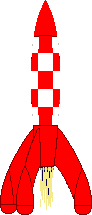
</style> .rocket
If you're using Safari 3 you may notice some problems with the animation, particularly when it reverses after you move the mouse away, but in the latest version of WebKit it's already much smoother. Also the animation in Opera is a bit erratic, with not all the elements being animated.
The dotted outline that appears during the animation shows the placement of the DIV containing the rocket image. This DIV translates across the screen while the image inside is rotated. Simple!
For the browser-impaired what's happening is that when you move the mouse over the space background, the rocket translates from the bottom left to the top right over a period of 3 seconds (translate()) and also rotates 70 degrees in a clockwise direction over the first 2 seconds (rotate()). The effect is rudimentary, but shows the potentional.
To have more control over the animation paths and timing, you can set up WebKit Keyframes. They also allow the animations to run automatically rather than in response to mouse events.
5. Multiple timing functions
#stage
#block
In this example we are applying four different transitions using four different timing functions.
When you :hover over the area to the right the blue box will spin, change color from red to blue and move from the top left of the containing box to the bottom right over two seconds.
The first thing you will notice is that that the movement of the box appears to be curved rather than straight. That's because we've used the ease-out timing function for the horizontal translation andease-in for the vertical.
The other feature is that the colour change from blue to red takes place over the first second of the two section transition, followed by the rotation which takes place over the second second.
The trick to this is that instead of defining the -webkit-transition as a single property, you can break it up into component parts. We've also made use of -webkit-transition-delay which allows you to set the starting point of different effects.
Here are the relevant CSS statements:
#block {
  ...
  background: blue;
  ...
  -webkit-transition-property: left, top, background, -webkit-transform;
  -webkit-transition-duration: 2s, 2s, 1s, 1s;
  -webkit-transition-timing-function: ease-out, ease-in, linear, ease-in-out;
  -webkit-transition-delay: 0, 0, 0, 1s;
  ...
}
#stage:hover #block {
  left: 100px;
  top: 100px;
  background: red;
  -webkit-transform: rotate(360deg);
}
The rules affecting the background colour transition have been highlighted.
Firefox does not appear to support the transition-delay option requires units to be specified even for zero values in -moz-transition-delay, so 0s, 0s, 0s, 1s will work for the example above.
6. Hover over one element to affect another
A couple of people have asked about triggering animations in relation to a click or hover event elsewhere on the page. With JavaScript this can be done by using an event handler to set or change the className of the element to be animated, and to have a transformation orkeyframes associated with the new class.
Using CSS there are some options for targeting related elements. These involve selectors such as the > (child), + (adjacent sibling) and ~ (general sibling) combinators.
The preceding examples all required a direct hover event either on the element itself or on its container, wheras in this example the blue box is animated only when you hover over its sibing, the red box:
#box1
#box2
#stage2
The relevant CSS code is as follows. Note that we are using the + adjacent sibling combinator to target #box2 when #box1 experiences a hover event. The ~ combinator may be more flexible in letting you target elements that are further away from the triggering element (some examples).
#box2 {
  position: absolute;
  left: 120px;
  ...
  background: blue;
  ...
}
#box1:hover + #box2 {
  -webkit-transform: rotate(360deg);
  -moz-transform: rotate(360deg);
  -o-transform: rotate(360deg);
  -ms-transform: rotate(360deg);
  transform: rotate(360deg);
  left: 627px;
  background: yellow;
}
Of course we can still animate the first box at the same time as targeting it's sibling or siblings:
#box3
#box4
#stage3
Just be sure not to move the hovered element out from under the pointer or the animation will stop/reverse.
These examples work more or less as intended in WebKit (Safari, Chrome), Firefox and Opera. They may also work in IE10 or higher - if anyone can confirm that please let us know.
7. References
8. Translations
- Belorussian - by softdroid